Problem to solve
Why an audit tool?
Whether a site needs a full redesign, a partial one or ongoing care, it starts with an audit: what's working, what needs improving and whether the brand and experience are delivering on the metrics that matter — conversion, retention and adoption.
There's a baseline that applies to any site, in any industry.
When it follows a pattern, it's a good candidate for automation. It'll get me to a good starting point, faster.
Process
How I audit now
Same every time
Different every time
Goals + scope
Business goals, target audience, pages in scope.
15 min
Capture pages
Screenshots at three key sizes.
60 min
Auto
Sort into a file
Name, order, annotate.
30 min
Auto
Audit findings
Message, navigation, trust, page speed, etc.
2 hr
30 min
Strategy
Bigger picture: audience fit, structure, priorities.
45 min+
Share it
Report, plan or email for the client.
45 min
15 min
Up next: Ideation
Time: ~3hrs | Tools: Claude Pro, Claude Design | Output: Five wireframes, two prototypes
Scoping
Context and guardrails
I wanted to see how well AI can design and build a smart tool, with some guardrails but not too many.
What I gave AI
→
How I audit: Screenshot the key pages, check each against the same criteria, then pull it into a report or plan.
→
Key criteria: Message, navigation, trust, next step and conversion, plus "website best practice".
→
A few lines on style: Mostly white, black for key actions, soft corners, pastel notes.
The guardrails
→
I check everything: AI drafts, I decide.
→
AI designs: See how intuitively AI designs UI/UX flows on its own.
→
Claude Pro only: No paid API or extra tools.
→
Built for a big screen: Desktop, where designers do this work.
Prompt wireframing
Five rounds in three hours
Each round started with AI's draft and ended with my feedback, mostly by voice, the way I'd talk through it with a colleague.
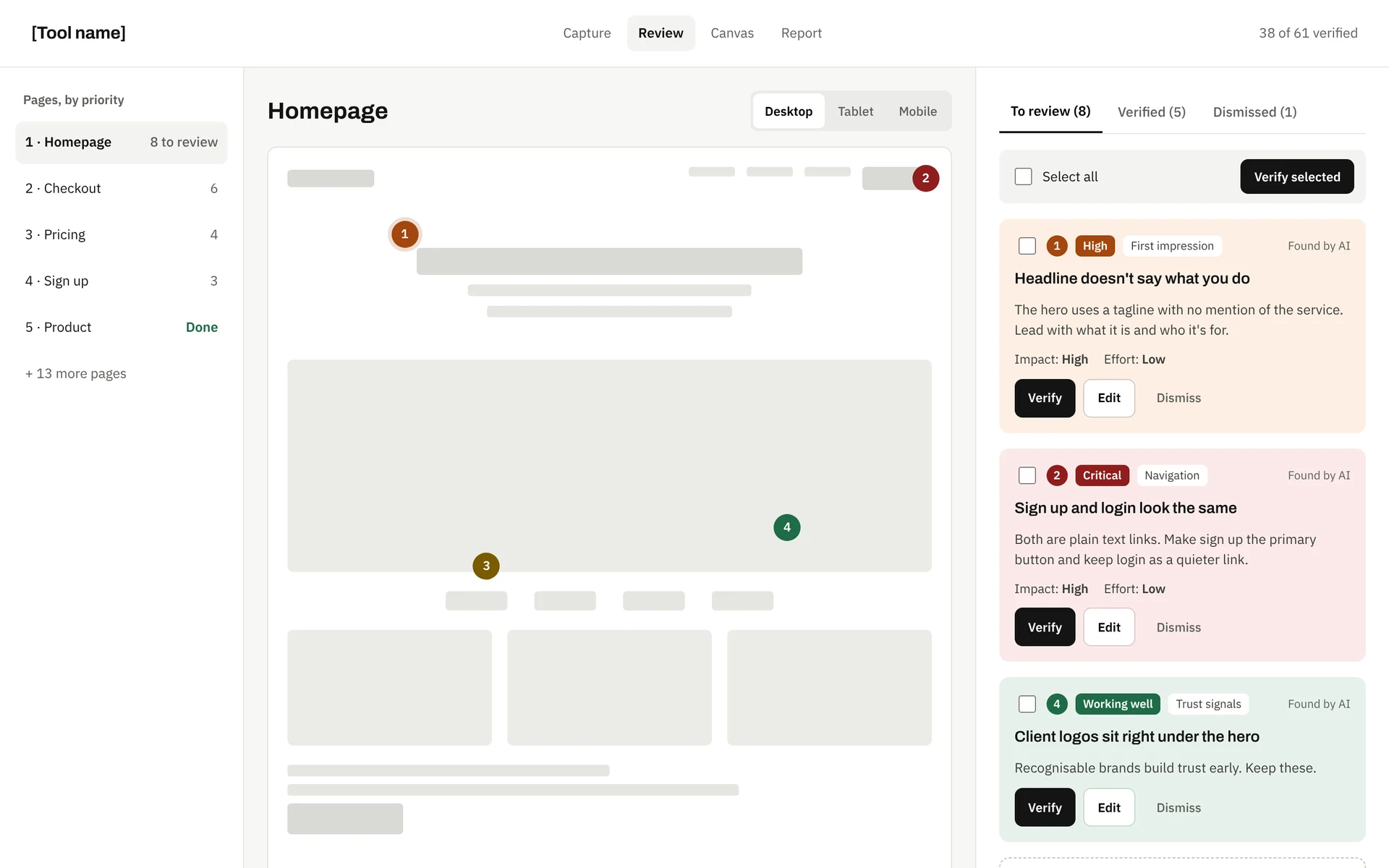
Round 1: AI's first draft
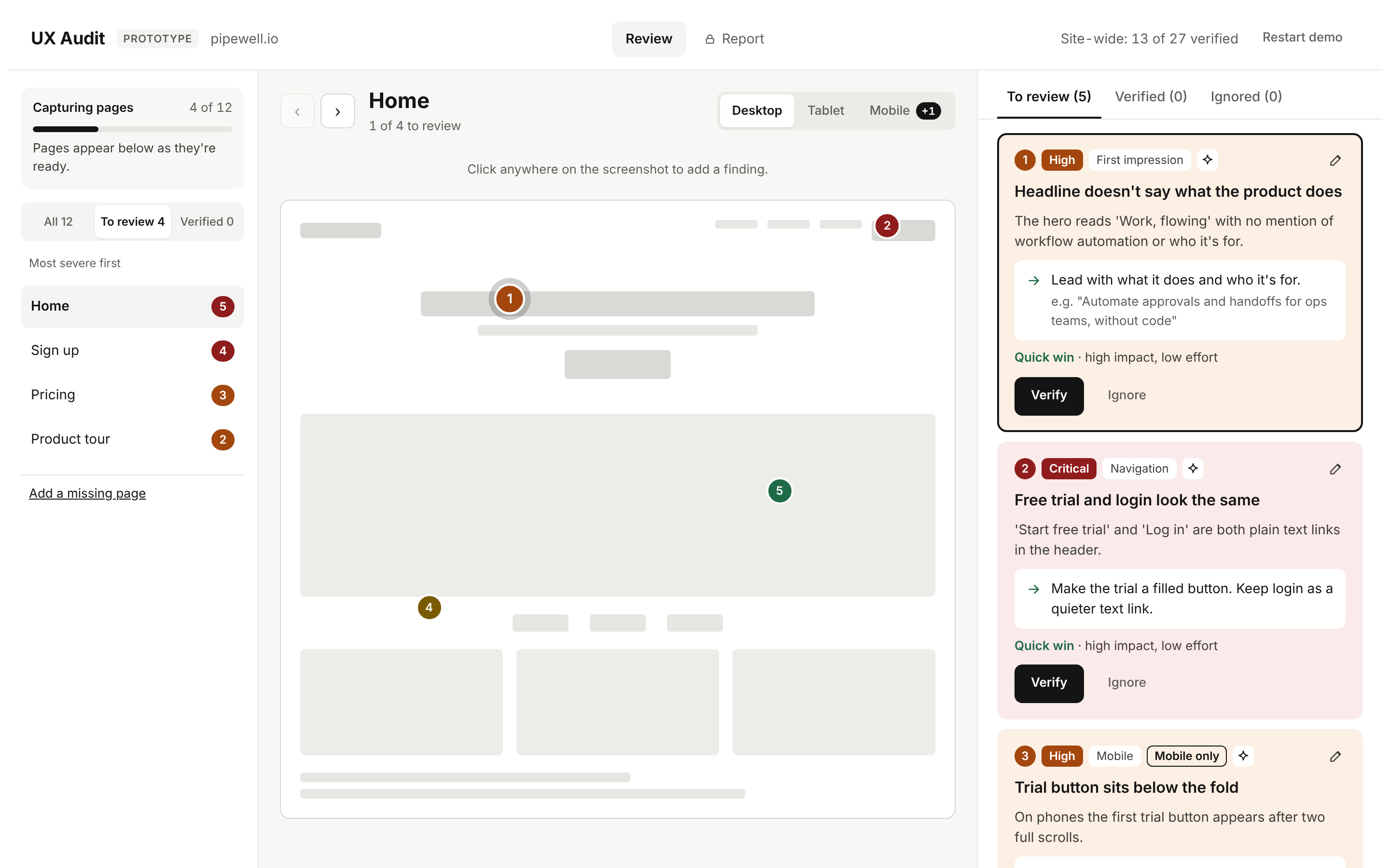
Prototype 2: After five rounds of feedback
Round 1 + 2
Cut what wasn't adding value. Extra screens and inputs were busying and/or not informing results.
Round 3
Clearer statuses, page-by-page controls, and "ignore" instead of "dismiss".
Round 4 + 5
AI defaulted to explaining how things work. People need to know how, not read how.
Prototype 1 + 2
Familiar UX and behavioural patterns, with colours only where it matters.
Up next: Prototype
Clickable prototype
Try it out
Where AI was strong
✦
Clear, consistent UI from a few sentences of direction.
✦
A thorough framework from a short prompt, including checks and flow details I hadn't defined.
✦
Speed: each round of feedback took minutes to apply.
Where it still needed me
The first draft worked, but using it didn't feel that way. AI missed some basic interaction and usability details that make a tool feel easy: panels that didn't scroll independently, pins that didn't open their finding, a shifting header, and filters that hid when they should focus.
Reflection
Solidified ideas
→
Looking right is quick, being right takes a designer: AI gets to polished fast, but we need to know what's wrong with it.
→
I don't always know what I'm missing: AI won't flag costs, limits or build needs unprompted. Domain knowledge i.e. DEV is still very important.
→
A wireframe in minutes sharpens decisions: Seeing it quickly makes the calls easier.
Next steps
A prototype = clearer thinking
Having something working makes it easier to define and refine the MVP. It surfaces missed use cases and other problems worth solving.
→
The review works: The flow feels right. The big open question is whether AI can capture a real site and audit it well.
→
The report needs the most work: It's detailed, but I have no insight into how the score is calculated, and it doesn't feel easy to follow for someone who wasn't part of the audit.
→
It also needs a plan: When the audit is the first step of a redesign, the next step is a plan — quick wins first, then the deeper work.
Up next: Testing
Time: ~1hr | Tools: Claude Pro, browser in Claude desktop app | Output: 3 sites, 53 findings
Scoping
Test before building
The prototype shows how a review works, but the findings are made up. Before building the working tool, I wanted to know two things: can it capture a site properly, and are AI's findings good enough to build around?
Capture
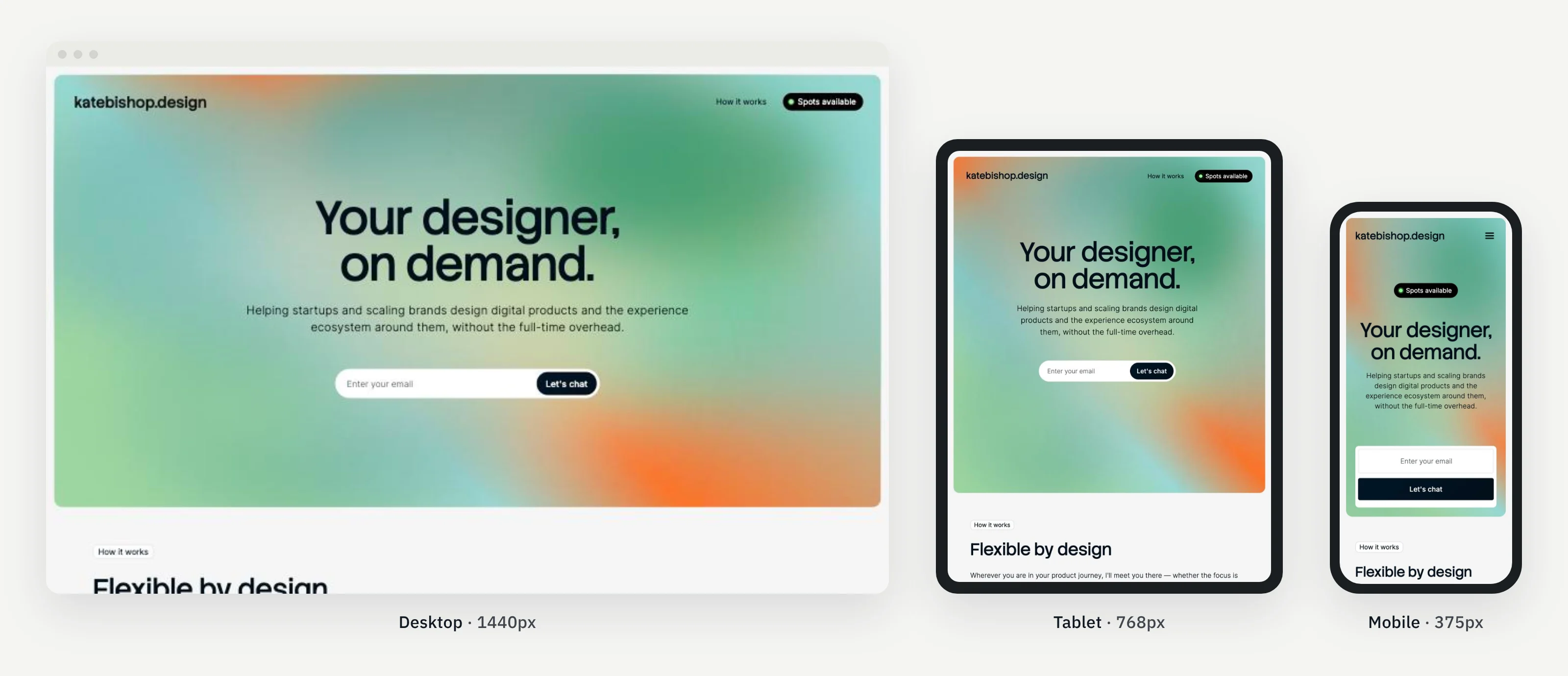
Each page at desktop, tablet and mobile widths, using only what I already had: Claude Pro and the browser built into the Claude app.
Findings
AI runs my framework over each page and writes findings in the tool's format. I mark right, partly right or wrong and note anything missed.
Process
How it ran
Sample capture at three sizes, shown on my own site.
Three sites, different goals
A services business I'd redesigned, so I knew its issues (book an appointment), an online store (buy), and a small maker business (get a quote).
Three inputs per page
Screenshots at each width, the page text, and quick checks run inside the page: headings, labels, link targets and button sizes.
A review sheet
I mark every finding against its screenshot, so the score comes from my judgement, not AI's.
Results
What capture showed
→
It works, with limits: Mobile and tablet were clear. Desktop depended on the window size and full pages had to be captured one screen at a time. The working tool needs a proper capture library (Playwright was suggested).
→
Screenshots and page checks need each other: Pop-ups made headings look cut off when they weren't, and text alone flagged a working embed as broken. Together, they caught both.
→
Speed needs its own tool: Load times from the browser weren't reliable, so performance will come from PageSpeed Insights.
How good were the findings?
Broken links and buttons, missing key details, typos, accessibility gaps. The findings proved useful.
What it missed told me more. Most fell into three groups:
→
Strategy: It looked at pages one at a time. It didn't step back and ask who the site is for, whether the structure suits them, or whether what was listed as the core services made sense for the target audience. That was the heart of my own audit of the same site.
→
Depth and feel: Pages that are technically fine, but thin, text-heavy or overwhelming next to good sites in the same category.
→
Key pages it never saw: Some issues were on important pages, like cart, search, and a contact form, that weren't in the small set AI picked to capture.
It also didn't know about constraints: a booking system that couldn't deep link, a template that only allows a carousel, rules about showing reviews for health services. Several of its fixes were right but not possible on the platform.
Reflection
What I learned
It's a strong first pass, not the audit
It covers the baseline across every page faster than I could, and it's accurate. The strategic layer is still mine, and that's the part clients pay for.
Context makes fixes useful
Knowing the platform, the template and any known constraints upfront turns a correct finding into a doable one.
Evidence has to match the finding
Two screenshots didn't clearly show what the finding described. If I can't see it, I can't verify it quickly.
Next steps
Revisions before the build
→
Ask for the platform and known constraints when setting up an audit.
→
Capture every page, not a sample AI picks, plus key states like cart, search and forms.
→
Pin screenshots to the exact element each finding talks about.
→
Keep strategy as my layer: audiences, structure and direction sit above the findings, in my words.
Coming soon: Working tool